Use design elements to add visual interest and to help tell stories from Stan State. When used consistently, these elements create continuity in our families of materials.
These elements are not meant to be used all at the same time, but here are some ways you can use 2-3 of them at a time shown in the examples on the following pages.
Halftone Grunge
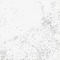
This texture should be used (in various primary and secondary colors) on top of large fills of colors and within our Abolition typeface. Keep the “dots” in this texture at a small and subtle scale.
Red Grid
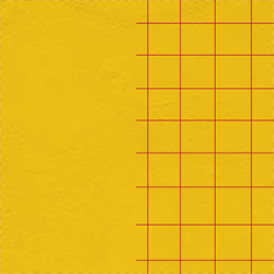
This pattern is primarily used in red over large yellow fills of color — use this sparingly on the edge of a composition.
Wave Pattern
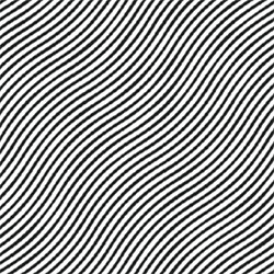
This pattern is primarily used over photography, but can also be used over large fills of color.
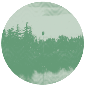
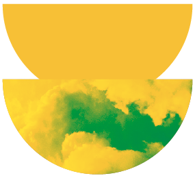
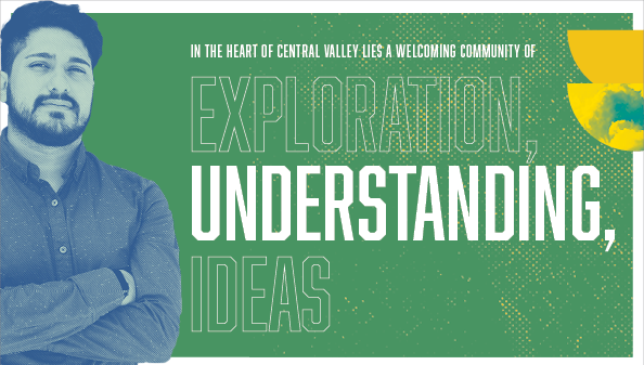
Circles and Semi-Circles
Circles and semi-circles are background elements that can be varying primary and secondary colors and can hold duotone photography. Experiment with the size and placement of these shapes — allow them to break the grid, page, and borders of pages.
Collage
Collage layouts are a core component of our visual language. They can be arranged in endless variations from three basic elements: type, shapes, and photos. Here are some tips for building your own.
Photo Cut-Outs
Make photo cut-outs the focus of a layout — they can break outside the border, sit in front of the text and anchor a collage with many elements.
Outline Type
Outlining our strong, loud Abolition typeface can help break up headlines longer than 1-2 words.
Add Texture
Insert the pattern or texture image and change it to a contrast color to add depth and visual interest to color floods and Abolition headlines.
Extend Outside Border
Use a thick white border around compositions and allow graphic elements and cut-out photography to break outside of it.
Updated: August 29, 2023