About Typography
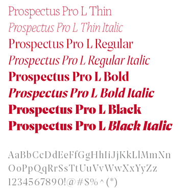
Our fonts can be combined in various ways to create different moods. When deciding on the typography for a piece, consider the audience and occasion. Prospectus Pro L & S tend to feel more academic, while Abolition is more informal.
Download: Prospectus Pro L & S | Abolition
Note: Prospectus Pro L & S are free for download and personal use at the link above, but we will always be using the fonts in a commercial setting — so be sure to obtain a commercial license at cost.
Display
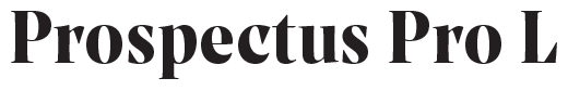
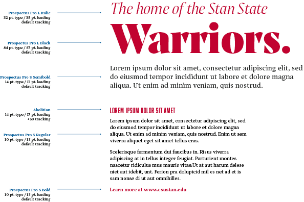
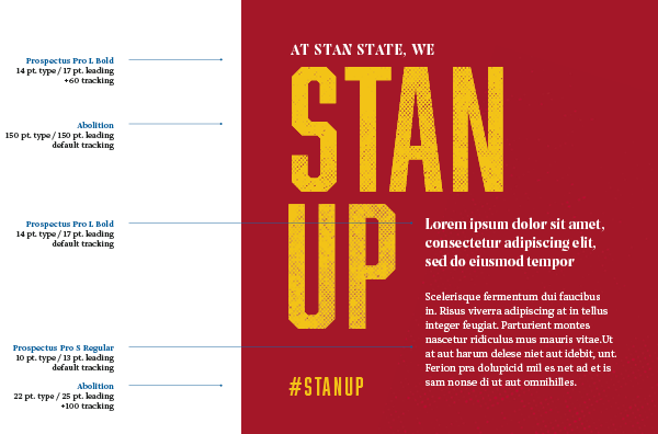
Prospectus Pro L can be used at varying weights for headline copy.
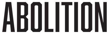
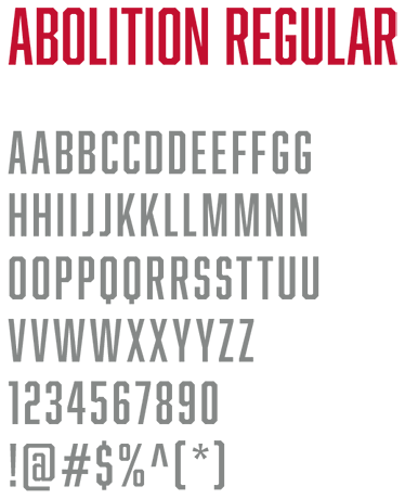
Abolition is used at a single weight for headline and call-to-action (short-form) copy
Text
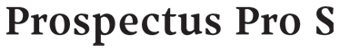
Prospectus Pro S can be used at varying weights for long-form body copy.
These fonts are the free alternatives for our Brand typefaces — they should only be used in instances when Prospectus Pro L&S and Abolition are unavailable.
They are accessible for free online. Once activated, they can be used across multiple programs and platforms.
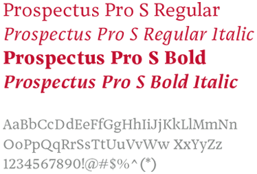
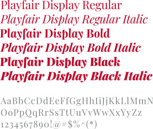
Download: Playfair Display | League Gothic Condensed | PT Serif
Prospectus Pro L — Alternative

Playfair Display can be used at varying weights for headline copy when Prospectus Pro L is unavailable.
Abolition — Alternative

League Gothic Condensed is used at a single weight for headline and call-to-action (short-form) copy when Abolition is unavailable.

Prospectus Pro S — Alternative

PT Serif can be used at varying weights for long-form body copy when Prospectus Pro S is unavailable.
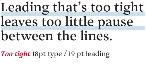
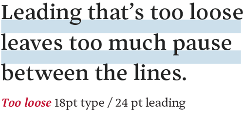
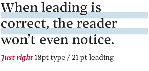
Line spacing, called leading, should be set tight, but not too tight. For body copy, try leading that’s two or three points higher than the type size.
The space between letters is referred to as tracking. As a rule, set tracking slightly looser for captions, and slightly tighter for headlines.
We use hierarchy in combination with the many elements of our visual language to display headlines, marketing messages and guide users to the most relevant or important information.
Example 1
Example 2
Updated: March 21, 2025