Update on Title II Requirements
On April 20, 2026, the Department of Justice extended the Title II compliance deadline by one year.
What does this extension mean?
Requirements remain unchanged. Departments should continue reviewing materials, prioritizing high-impact content and address any digital documents that do not meet WCAG 2.1, Level AA accessibility standards. The extension only provides additional time and should not be viewed as a pause in our work. Please continue following best practices for creating accessible documents.
This webpage shares best practices and considerations to ensure your department creates accessible documents.
Navigate to a section:
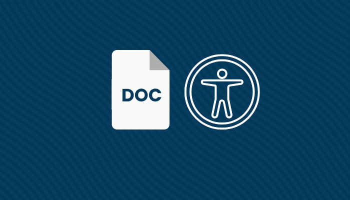
This section provides information on document accessibility. To comply with Title II updates, documents, including forms, must be made accessible prior to being publicized on the university website.
Accessible documents contain features that assist users with disabilities in using and understanding the information contained inside a document. As a best practice, university documents should always be created in software that can incorporate accessibility features. All documents, regardless of file format, must be evaluated prior to being shared on the website.
Programs such as Microsoft Office Word, Adobe InDesign, Adobe Acrobat and Google Docs can be used to create accessible documents. See the Accessibility Features section to learn more about the accessibility features required to make documents accessible.
What not to do with documents
Avoid creating documents and forms inside web-based graphic design platforms such as Canva or similar. These platforms too often lack crucial accessibility features required to make documents fully accessible and compatible for users of assistive technologies.
Accessible PDF forms require additional features to ensure that users with disabilities can interact with them.
PDF forms involve integrating features such as:
- Data entry fields / input text fields
- Check box or choice options
- Radio buttons (form bubbles)
- Electronic Signatures
- Drop-down options
- Rating scales
Check out the Evaluating Documents section to learn more.
Updated Title II requirements require public institutions, including public colleges and universities, to make their services, programs, and digital content accessible to people with disabilities. It protects qualified individuals with disabilities by helping ensure equal access to websites, mobile apps, documents, and other public-facing services.
Title II's scope includes all document file types available for download or reference on your website, including but not limited to:
- Word
- PowerPoint
- Excel
This also includes any documents currently in use for classes, University services, policies, steps, etc.
Free educational trainings are available, including on-campus trainings and external opportunities.
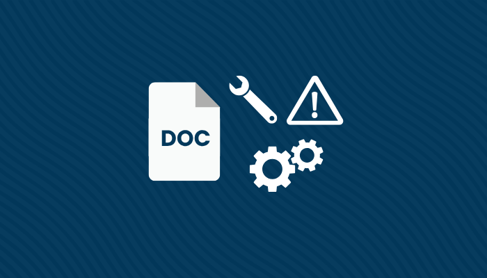
This section provides information for when to consider the document remediation process. Please note document remediation is difficult and laborious than alternative formats.
Document remediation is the process of updating an existing document file to make it accessible. In many instances, remediation is much more difficult and time-consuming than creating a new accessible version of the document.
This answer will vary by department. Any documents that must remain linked on the university website should be prioritized for document remediation. Check out the Decision Matrix in the next section for more information.
If you elect to remediate a document, you can start by browsing tutorials in the Video Tutorials section.
Document Decision Matrix
The decision matrix below is intended to assist you in narrowing down which documents to prioritize for remediation. During your department document audit review, your department will inevitably encounter outdated files, or documents that are no longer needed or feasible to remediate. Please visit the Document Audits section for additional details.
| Questions to consider: | If Yes, | If Not, |
|---|---|---|
| Does this document need to be available on the website for users to download and/or reference? | Remediate the document | Remove from the website |
| Can the information from this document be incorporated as information on a webpage? | Add the information to an existing webpage OR create a new webpage | Remediate the document |
| Is this document still relevant? | Remediate the document | Remove from the website or archive |
| Is this document a flyer? | Remove from website and reformat the information in accessible manner for web | Remove from the website |
This answer will vary by department. Any PDF forms that must remain linked on the university website should be prioritized for remediation. Check out the Decision Matrix in the next section for more information.
If you choose to remediate a PDF form, you can start by browsing tutorials in the Video Tutorials section.
PDF Form Decision Matrix
The decision matrix below is intended to assist you in narrowing down which forms should be made accessible. During your audit review, your department will inevitably encounter forms that are obsolete, outdated or no longer required to have on the website. Please visit the Document Audits section for additional details.
It should be noted, PDF remediation is complex. Converting PDF forms to Microsoft Forms or Paperless Forms from the Office of Information Technology may be more feasible and time-saving.
| Questions to consider: | If Yes, | If not, |
|---|---|---|
| Does the form need to be available online for users to access & download? | Make the PDF form accessible |
Remove from the website |
| Does the form require any signature(s)? |
Convert the form into a Paperless Form by completing a ticket with OIT OR |
Convert to a Microsoft Form |
| Does the form collect simple data? | Convert to a Microsoft Form | Make the PDF form accessible |
You can consider the following solutions for instances when a document cannot be remediated.
| Solutions | Details |
|---|---|
| 1. Remove the document from the website | If a document is not feasible to remediate, remove it from your website. |
| 2. Turn the document into information available on a webpage | If the document is too difficult to remediate, incorporate its information into accessible content on a webpage. |
| 3. Recreate the document using best practices for documents | If the source document is not fixable or is not feasible to remediate, start a new accessible version of the same document. |
| 4. Proceed with document remediation | If a document must be remediated, check out the Trainings & Resources section for more information on trainings, document accessibility courses, and videos. |
| 5. Archive the document* | *Note that specific conditions must be met for content to be considered archived. Visit the Document Archiving Procedure webpage to learn more. |
Move to more accessible formats for your department forms. Departments are encouraged to use Microsoft Forms or Paperless Forms from the Office of Information Technology.
The table below can help you determine if Microsoft Forms or Paperless Forms would be ideal.
| If the form | Move to: |
|---|---|
| collects very basic information or simple text-based responses | Microsoft Forms |
| collects any sensitive, confidential, financial information - including signatures | Paperless Form |
Ready to Use Microsoft Forms?
Microsoft Forms is included in your employee Microsoft 365 access. Check out the video tutorials section and the MS Forms webpage to learn more.
Paperless Form
If your department form collects sensitive, confidential or financial information and/or signatures, you can create a ticket with OIT to request a Paperless Form.
This section shares critical accessibility features that can help your documents more accessible. Note there are some formatting features that can impact visual and visually-impaired uniquely.
A best practices is to create documents using programs that incorporate accessibility features. Notable programs include: Microsoft Word, Adobe InDesign, Adobe Acrobat and Google Docs.
Check Document Title and File Names
When the document title and file name match, this ensures that users on screen readers are opening the correct document.
Remove any words such as: DRAFT, FINAL VERSION or UPDATED as these can add confusion to users on screen readers when they are included on the file name.
Most document processors allow you to add document titles under "file properties". The tutorials below show how to set document titles in Adobe Acrobat and Microsoft Word.
Add Document Headings
Headings help create an outline and make it easier for users of screen readers to browse your document.
- Headings allow visually-impaired users on screen readers to jump between parts of your document.
- Headings must follow the heading hierarchy.
- When headings do not follow the heading hierarchy, it creates makes the document confusing for visually-impaired users.
- Impacts both visual users and visually-impaired users.
Add Alt Text Descriptions to Images
Provide meaningful alt text descriptions on the images shared in your document.
- Alt text descriptions are short image descriptions available to users with visual impairments (on screen readers).
- When an image is encountered by a screen reader, it will look for the provided alt text description and read it aloud to the visually-impaired user.
- When an image in your document does not add value or is purely for decorative purposes only; it can be marked as decorative, so that a screen reader can ignore it.
- *Certain images can be marked decorative if they do not add value to users
- Check out the Decorative Images help page from W3 to learn when an image can be considered decorative.
- Impacts visually-impaired users
Check Color & Contrast
Use colors that contrast well so that your document remains legible to visual users.
1. Maintain good color contrast.
- If possible, stick to the default black font color or choose a dark font to ensure easy readability.
- Avoid modifying the document background color.
2. Do NOT assign meaning to color.
- Why? A percentage of visual users may be colorblind, which greatly impairs their abilities to distinguish certain colors.
- Avoid marking critical information with color alone. Convey importance by using words or text, rather than color.
- Impacts visual users.

Format Hyperlinks
Links in your document should use wording that is clear about the link's destination or its purpose.
- Avoid generic phrases like “click here,” “read more,” or “learn more.”
- These phrases lack context and do not explain the destination or action.
- Avoid pasting full webpage URLs in your document. These will be read aloud to users on screen reader devices and can become a distraction.
- Impacts both visual users and visually-impaired users.
Tables Should Use First-row Headers
Tables with first-row headers greatly assist users of screen readers.
- First-row headers assist screen reader users in understanding how the table is structured.
- First-row headers also assist visual users comprehend which columns pertain to the corresponding rows.
- Tables impact both visual and visually-impaired users.
Use Legible Fonts
Stick to fonts that are easy to read and legible to visual users.
- Sans-serif fonts are recommended for readability.
- Sans-serif fonts include: Arial, Calibri, Aptos.
- Serif fonts include: Times New Roman, PT Serif, Cambria.
- Impacts visual users.
Use the Bullet/Number List Features
Bullet and numbered lists help improve the readability for both visual users and visually-impaired users.
- If item order does not matter, use a bulleted list.
- If item order does matter, use a numbered list.
- Impacts both visual users and visually-impaired users.
Remove Blank Paragraphs
Avoid using the "Enter" key to create blank paragraph space in your documents.
- Screen readers can detect blank paragraphs and will read them aloud, which can become distracting.
- Instead of using the “Enter” key to create empty space, use paragraph spacing options in your word processor.
- Impacts both visual users and visually-impaired users.
Document audits provide a snapshot of all the documents currently linked on your department website. To prepare for Title II, each item listed in your department audit sheet should be evaluated for compliance.
If you have not started your department document audit, please begin now.
Reviewing your audit findings as a team is highly encouraged, as it will help expedite the audit process. Files that are not accessible should be either: remediated, removed from the website, converted to web content or in some instances, archived. The Decision Matrix can be used to help determine the appropriate outcome for each linked document.
- Open each document link listed in the Document Link column.
- Review each document's accessibility.
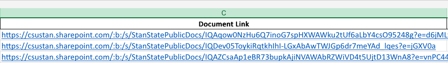
- In the Document Accessibility column, indicate one of the following file statuses:
- Remediate (Only use this for files you plan to make accessible)
- Accessible (Only use for documents that are confirmed as accessible)
- Delete from website
- Convert to web content or online form
- Archive*
Items Marked for Document Remediation
If your department plans to keep files on the website, those documents must be prioritized for remediation and made accessible. If you decide to remediate, you can explore resources in the Document Remediation section.
File Archiving
*Specific conditions must be met for files to be considered archived. Visit the Document Archiving Procedure webpage for more details.
Need a copy of your Document Audit?
Please contact the Web Services Team at webupdate@csustan.edu.

This section contains information materials, trainings as well as free courses on document accessibility and related topics. Courses offer a deeper dive into more advanced document features. Additional information can also be found in the Video Tutorials section.
Trainings
These one-hour introductory workshops will show you:
- The basics of document accessibility
- How to enable accessibility features to create accessible documents in Microsoft Word
- Check out the next sections to learn more about fixing advanced documents
Free Online Courses
This free, self-paced course helps faculty and staff create accessible Word, PowerPoint, Excel, and PDF documents with a bonus option to learn about spreadsheet accessibility. Participants gain long-term skills to integrate accessibility principles into instructional materials and course design. The course is provided by WebAIM and the Office of the Chancellor.
Enroll using your staff email.
- Format: Asynchronous (self-paced, Chancellor's Office Canvas course)
- Start Dates: First Monday of each month
- Duration: Flexible – up to 180 business days to complete
Check out these free LinkedIn training courses that can show you how to fix documents that contain more advanced features including fillable fields, drop-down options, and more.
Courses require Stanislaus State login credentials
These free, self-paced courses show you how to create accessible documents in Microsoft Word.
The instructional videos are provided by the General Services Administration and were developed by the Accessible Electronic Document Community of Practice.
This section provides information for evaluating documents, reviewing accessibility features, including precautions with automated remediation tools. A best practice is to always review document accessibility before distributing it on the university website.
All document processors contain built-in accessibility checkers that can gauge your file's overall accessibility. While these accessibility checkers are helpful, they do not account for every possible mistake contained within a document. Manual checks should still be incorporated into your assessment processes.
Documents exported in a PDF file format require checks to ensure accessibility.
Adobe Acrobat's built-in accessibility checker can help evaluate your document's accessibility. Please note built-in checkers cannot account for every possible mistake within the document. A manual review should be included when assessing document accessibility.
The table below includes items that must be assessed when testing your PDF documents & forms. Please note: PDF Forms include the same document accessibility principles as documents but require additional efforts to make their features accessible.
| Feature | Details |
|---|---|
| Document Tags |
|
| Proper Reading Order |
|
|
Check Boxes Applies to PDF Forms |
|
|
Electronic Signatures/ Adobe Sign Applies to PDF Forms |
|
|
Data Entry Fields/ Fillable Fields Applies to PDF Forms |
|
|
Radio Buttons Applies to PDF Forms |
|
|
Drop-down options Applies to PDF Forms |
|
| Headings |
|
| Images |
|
| Item Lists |
|
| Hyperlinks |
|
| Tables |
|
| Color Contrast |
|
Please note that many automated and AI-based tools are new and evolving technologies, which can make mistakes. These tools should not be solely relied upon to create compliant documents.Documents should still be assessed manually to ensure documents are accessible.
Automated Tools
Be wary with features such as the "auto-tag document" feature found in Adobe Acrobat. This feature does not guarantee that your document is accessible and thus should be reviewed prior to its distribution.
Reviewing AI-Remediated Documents
Documents remediated with AI or any automated tool still need to be reviewed and tested by humans to confirm compliance. The following videos provide tips for checking your document’s accessibility in Microsoft Word and Adobe Acrobat. Additional information can be found in the Trainings & Resources section.
This section contains videos on document accessibility and related topics. The videos and materials included in this section are credited to their original creators.
Most forms that do not require a signature or collect sensitive information, can be recreated in Microsoft Forms, which is a more accessible option since they generally work better with screen readers and keyboard navigation.
Some forms that could be converted to Microsoft Forms include:
- Appointment request forms
- Event registration forms
- Feedback forms
- Intake & Interest forms
- Item / inventory checkout forms
- Project request form
- Rating forms
- Submission forms
- Suggestion forms
- Surveys
- Volunteer sign-up forms
- Question submission form
Benefits of Using Online Forms
| Benefit | Why It Matters |
|---|---|
| Better screen reader support | Microsoft Forms generally work better with screen readers and keyboard navigation than fillable PDFs, which more often create barriers since they are not always built correctly. |
| Less complicated than a fillable PDF | A fillable PDF has to be carefully tagged, labeled, ordered, and tested for accessibility. MS Forms are often a safer option because they reduce the chance of those issues being encountered. |
| Easier to update & maintain | Microsoft Forms can usually be edited, shared, and updated more efficiently than remediating a PDF, which can help your department in keeping content accessible over time. |
| Supports campus login options | Microsoft Forms can be configured to require a campus login, which can help limit access to Stan State employees, staff, or students when relevant. |
| Useful for common department processes | Ideal for forms that are used for requests, registrations, feedback, questionnaires, checkouts, and other routine department processes that do not require a signature. |
Have Complex PDF Forms?
PDF forms with complex features require additional steps to make accessible. Check out the next section to learn more about complex PDF forms.
PDF forms with more complex features such as fillable fields, drop-down menus, radio buttons, ratings and signatures should be created only when necessary. If you opt to create a more complex PDF form, please ensure its accessible prior to distributing.
Updated: June 04, 2026